Brand & media kit
Marks, colours, type and product shots you can use in an article or a partner announcement — plus the boilerplate, so nobody has to invent a description of us.
Logo
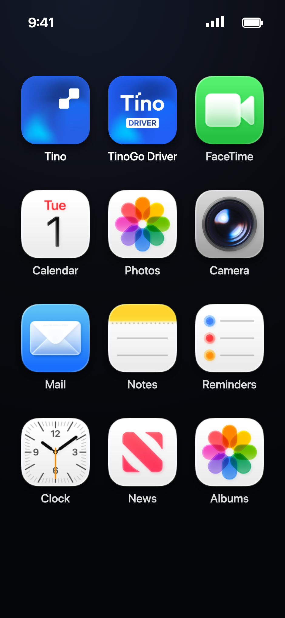
The app icon is the primary mark; the wordmark is for headers, documents and anywhere the name needs to be read. Use the dark wordmark on light backgrounds and the light one on dark or photographic backgrounds.










Usage
Editorial use of these marks needs no permission. Anything that implies a partnership, endorsement or joint product does — write to press@tino.mn first.
Colour
Two blues carry the brand: the deep hero blue for full-bleed moments, the interface blue for anything interactive. Everything else is ink and neutrals.
Type
Onest, everywhere, with Cyrillic and Latin from the same family. Headlines sit at semibold with tight tracking; body copy stays regular for legibility at small sizes.
Product shots
Screen and lifestyle images cleared for editorial use. Please keep the credit “Photo: Tino” on lifestyle shots.



Boilerplate
Copy these as-is. If you need a shorter version for a caption, the one-liner is the approved cut.